

Interior design is not just about selecting furniture or decorating walls. The colors, textures, and materials used throughout a space influence its character, atmosphere, and visual balance. Among the materials gaining attention in contemporary architecture, terrazzo stands out for its distinctive patterns, versatile appearance, and wide scope for customization.
The right terrazzo color combinations for interiors can help create anything from a calm, minimalist living room to a dramatic luxury bathroom or a vibrant commercial space. With different base colors, marble fragments, glass aggregates, and decorative inlays, terrazzo offers architects and interior designers the freedom to develop surfaces that complement a wide range of design styles.
At Elbrus Solutions, terrazzo is used across applications such as flooring, wall panels, stair treads, tabletops, vanities, and washbasins. Selecting the right color palette can help bring these elements together and create a coordinated interior.
In this guide, we explore some of the most appealing terrazzo color combinations, where they work best, and how to choose a palette that suits your space.
What Makes Terrazzo a Versatile Choice for Interior Design?
Terrazzo is a composite material made by combining a binder with decorative aggregates, which can include marble, glass, and other suitable fragments. The finished surface is ground or polished, depending on the intended appearance and application.
One of terrazzo’s most interesting characteristics is the relationship between its background color and the visible chips. A light base with subtle fragments can create a quiet, understated effect, while a darker base with contrasting aggregates can become a striking design feature.
Terrazzo also works across multiple applications. The same color palette can be incorporated into flooring, wall cladding, countertops, decorative furniture, and bathroom surfaces to establish visual continuity.
The best results come from choosing colors that complement the surrounding architecture rather than treating the terrazzo surface as an isolated design element.
1. White and Multicolor Terrazzo: A Fresh, Timeless Combination
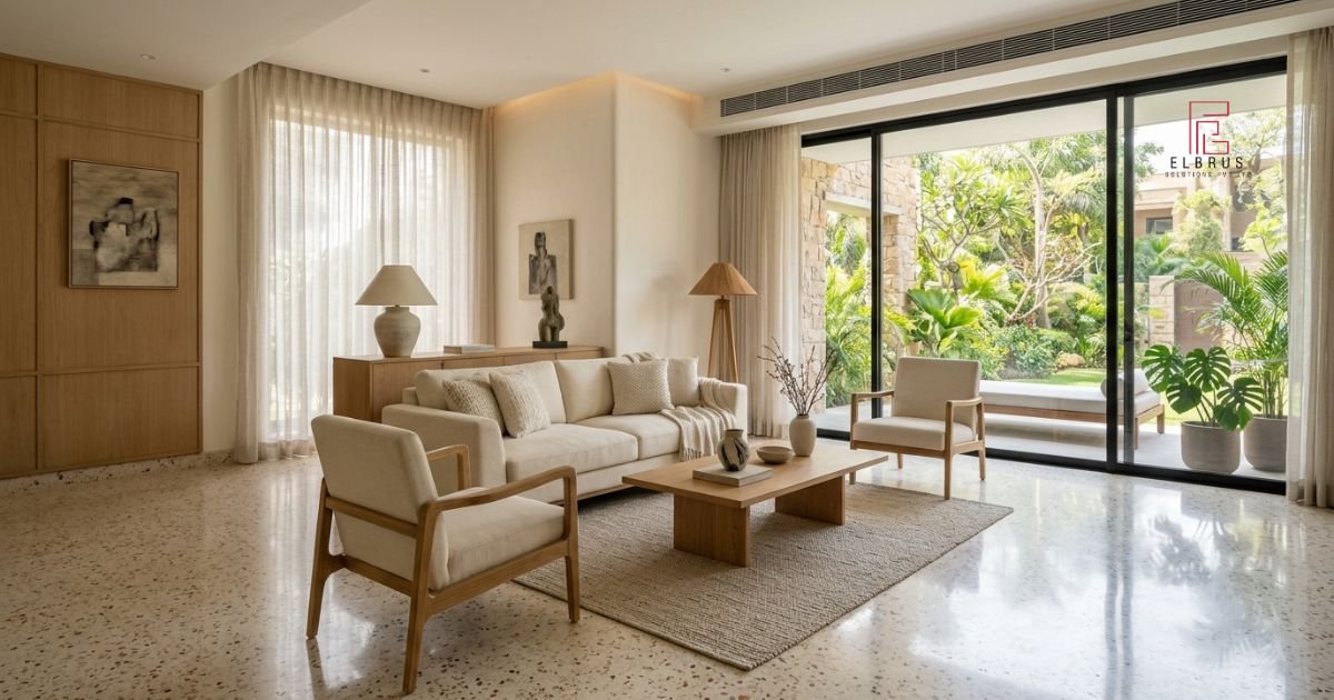
White terrazzo with carefully selected multicolor aggregates is a popular option for interiors that need brightness, openness, and visual interest.
A white or warm-white background can feature small or medium fragments in grey, beige, black, muted green, or terracotta. This creates a balanced pattern that adds detail without overwhelming the room.
Where does this combination work best?
- Living room and dining room flooring
- Contemporary kitchens
- Bathroom walls and floors
- Reception areas and showrooms
- Minimalist residential interiors
Styling tips
Combine white terrazzo with light oak furniture, cream upholstery, and simple architectural details. Black fixtures can introduce contrast, while indoor plants add a natural accent.
For compact rooms, smaller aggregate patterns may create a more restrained appearance. Larger chips can produce a bolder visual effect in spacious interiors.
2. Beige and Terracotta: Warmth with an Earthy Character
Beige terrazzo paired with terracotta, rust and ochre aggregates creates a welcoming palette inspired by natural materials.
This combination works especially well in spaces featuring wooden furniture, warm lighting, textured fabrics and earthy wall finishes. It can suit contemporary Indian homes, Mediterranean-inspired interiors and hospitality settings.
Where does this combination work best?
- Living rooms and bedrooms
- Boutique cafés and restaurants
- Hotel lobbies
- Dining spaces
- Decorative wall panels and tabletops
Styling tips
Pair beige terrazzo with walnut or natural oak furniture, warm-white walls, and linen upholstery. Terracotta accents can be introduced through cushions, pottery, or decorative objects.
For a cohesive interior, repeat one of the warmer aggregate colors in the surrounding decor. This helps the surface feel connected to the rest of the room.
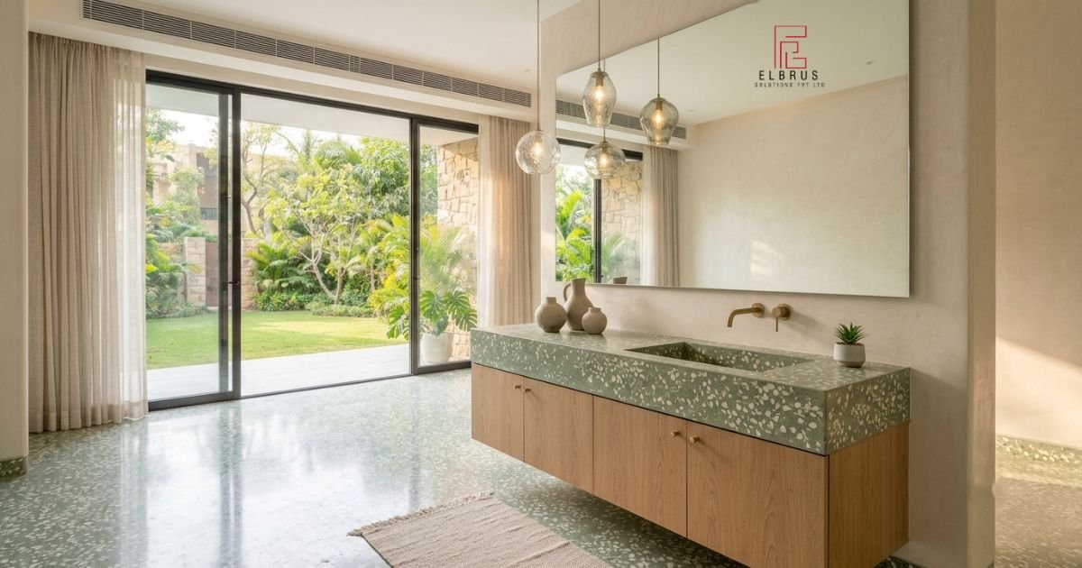
3. Sage Green and Ivory: A Calm, Nature-Inspired Palette
Sage green and ivory create a softer alternative to brighter green interiors. The combination feels subtle and contemporary, making it suitable for spaces designed around natural light and understated materials.
A sage-green terrazzo base can incorporate ivory, pale grey, and muted pink fragments. Alternatively, an ivory background with green aggregates can introduce the same color story in a lighter, more adaptable form.
Where does this combination work best?
- Modern bathrooms
- Kitchen countertops and islands
- Bedroom feature areas
- Wellness spaces
- Decorative vanities and washbasins
Styling tips
Complement sage green terrazzo with brushed brass hardware, natural wood, and off-white walls. Plants and soft textiles can reinforce the nature-inspired theme without making the space look overly decorative.
For kitchens and bathrooms, choose the surface finish and sealing system according to the intended application and expected exposure to moisture.
4. Black and White: A Bold Contemporary Statement
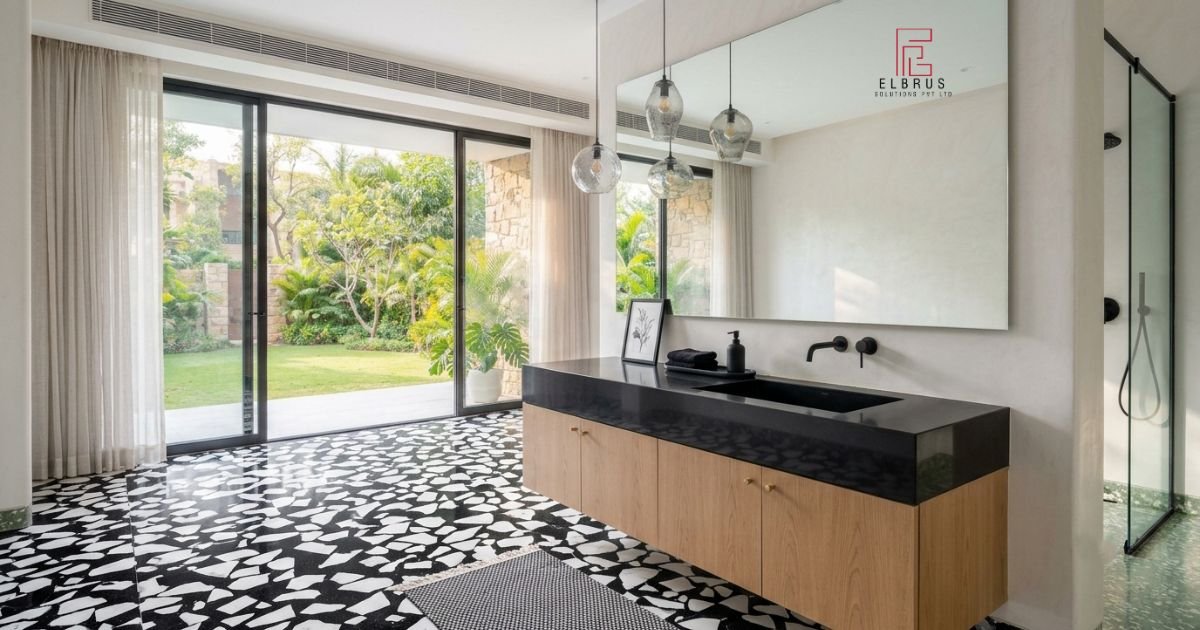
Black and white terrazzo offers a strong contrast that can anchor an interior. Depending on the background color, aggregate size, and distribution, the surface can look minimal, graphic, or dramatic.
A charcoal or black base containing white and pale grey fragments creates a distinctive statement. White terrazzo with black aggregates offers a brighter alternative while retaining a defined pattern.
Where does this combination work best?
- Luxury bathrooms
- Modern offices
- Entrance areas
- Retail interiors
- Kitchen islands and bar counters
Styling tips
Pair black terrazzo with white walls, restrained furniture and matte-black fixtures for a coordinated contemporary look. In larger rooms, dark terrazzo can be balanced with natural wood or warm lighting.
For smaller interiors, consider using black terrazzo on a vanity, tabletop or feature wall rather than across every surface. This preserves the impact of the contrast without making the space feel visually heavy.
5. Charcoal and Copper: A Premium, Architectural Look
For interiors that call for depth and metallic detail, charcoal terrazzo combined with copper, bronze, or warm-toned aggregates offers a distinctive option.
The darker background allows reflective metallic fragments and lighter stone chips to stand out. The result can complement contemporary luxury interiors, restaurants and carefully designed commercial environments.
Where does this combination work best?
- Hotel reception areas
- Statement countertops
- Bar counters
- Executive offices
- Accent walls and custom furniture
Styling tips
Use copper or bronze lighting, warm timber and neutral upholstery to soften the dark background. Metallic details are generally most effective when repeated selectively rather than used throughout the entire room.
If the terrazzo itself contains decorative copper or brass inlays, coordinate other metal finishes with those details to maintain a consistent visual language.
6. Dusty Pink and Cream: Soft, Contemporary Color
Dusty pink, warm cream, and pale grey create a gentle color combination that adds personality without relying on high contrast.
Terrazzo featuring a cream background with pink, blush, and subtle grey aggregates can work well in contemporary interiors that benefit from a softer visual identity.
Where does this combination work best?
- Powder rooms
- Bedroom vanities
- Boutique retail spaces
- Cafés and creative studios
- Decorative tabletops
Styling tips
Pair the surface with ivory furniture, light timber, rounded forms and subtle brass accents. For a more contemporary appearance, introduce a small amount of charcoal through lighting, cabinet handles or furniture legs.
This palette works particularly well when the surrounding finishes remain simple, allowing the terrazzo pattern to provide most of the visual detail.
7. Grey and Blue: A Refined, Modern Palette
Grey terrazzo with navy, slate-blue or muted teal aggregates can create a structured, contemporary appearance.
The cool background tones work well with clean architectural lines and understated furniture. Depending on the shades selected, the palette can feel professional, relaxed or distinctly urban.
Where does this combination work best?
- Modern apartments
- Office interiors
- Bathrooms
- Retail spaces
- Reception desks and wall panels
Styling tips
Combine grey and blue terrazzo with brushed steel, white surfaces and natural wood. A few deeper blue accents can reinforce the palette, while lighter walls help preserve brightness.
For interiors with limited natural light, choose a lighter grey background and use darker blue primarily in the aggregates or accessories.
8. Olive Green and Sand: An Organic, Natural Combination
Olive green and sandy beige offer an earthy palette that works well with natural wood, stone-inspired finishes, and warm neutrals.
Olive terrazzo can contain cream, tan, and pale grey fragments for a layered appearance. A sand-colored background with green aggregates is another option when a lighter interior is preferred.
Where does this combination work best?
- Contemporary living rooms
- Kitchen surfaces
- Wellness interiors
- Boutique hospitality spaces
- Decorative basins and furniture
Styling tips
Use oak or walnut cabinetry, woven textures, and warm-white walls to complement the palette. Matte-black details can provide definition, while plants help connect the interior with its natural color scheme.
The key is to avoid introducing too many unrelated colors. Let olive green, sand, and the natural aggregate pattern establish the primary design direction.
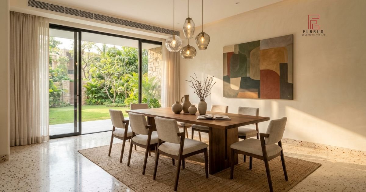
9. Cream and Greige: Understated Minimalism
For interiors where subtle detail matters more than dramatic contrast, cream and greige terrazzo is a practical design direction.
A warm, neutral base with fine fragments in beige, ivory and soft grey creates a consistent surface that complements a variety of furniture styles.
Where does this combination work best?
- Minimalist living rooms
- Open-plan apartments
- Bedrooms
- Corporate reception areas
- Large flooring installations
Styling tips
Pair neutral terrazzo with natural wood, soft-white walls and textured fabrics. The subtle variation in the aggregates adds detail without requiring additional patterns elsewhere in the room.
This palette is particularly useful when designers want the flooring or wall finish to work with different furniture and decor choices over time.
How to Choose the Right Terrazzo Color Combination
Selecting terrazzo colors involves more than choosing a favorite shade. Consider these factors before finalizing the material.
1. Consider the Size of the Room
Light backgrounds can help a room feel visually open, while darker surfaces can create depth and a more intimate atmosphere. The overall effect also depends on natural light, ceiling height, furniture, and aggregate pattern.
2. Evaluate Natural and Artificial Lighting
Colors may appear different under daylight, warm LED lighting, and cool artificial lighting. Always examine a physical sample under the lighting conditions expected in the finished space.
3. Coordinate Flooring, Walls and Furniture
Choose whether the terrazzo will act as the primary feature or provide a neutral foundation. If the surface has prominent, multicolored aggregates, keep nearby materials relatively restrained. If the pattern is subtle, furniture or wall accents can introduce stronger colors.
4. Select an Appropriate Aggregate Size
Fine aggregates typically create a quieter, more uniform appearance. Medium and large fragments make the pattern more visible and can become a focal point.
Think about the viewing distance and the dimensions of the installation before deciding on the aggregate style.
5. Match the Finish to the Application
The intended use of the surface matters just as much as the color. Flooring, countertops, decorative wall panels, and bathroom surfaces may require different specifications, finishes, sealing methods, and maintenance routines.
Discuss the proposed application with your terrazzo supplier before making the final selection.
6. Test Samples Before Ordering
Color references on a screen may not accurately represent the final material. Request samples and compare the background, aggregate shades, and finish together.
For custom projects, consider preparing a sample that reflects the intended color palette, aggregate composition, and polish level.
Where Can You Use Custom Terrazzo Colors?
Terrazzo can be used beyond traditional floor surfaces. A coordinated palette can bring different architectural features together while allowing each piece to serve a distinct purpose.
- Flooring: Establish the primary color scheme for living rooms, corridors, and commercial interiors.
- Wall panels: Introduce texture and aggregate detail to selected walls, reception areas and feature spaces.
- Stair treads: Continue the material palette between floors.
- Tabletops: Add a distinctive surface to dining tables, coffee tables and side tables.
- Vanities and washbasins: Coordinate bathroom surfaces with cabinetry, mirrors and fixtures.
- Outdoor furniture: Extend a compatible material palette into suitable outdoor settings, subject to the product’s specifications.
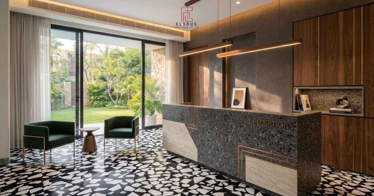
Elbrus Solutions offers terrazzo and concrete products across several of these applications, making it possible to consider color coordination across multiple interior elements.
Why Consider Elbrus Solutions for Terrazzo Design?
Elbrus Solutions works with terrazzo and concrete surfaces in a range of colors and textures. Its product portfolio includes flooring, wall panels with marble, glass, copper and brass inlays, stair treads, tabletops, outdoor furniture, vanities, basins and bathtubs.
For architects, interior designers and homeowners, this range provides options for exploring a consistent material direction across different parts of a project.
When planning a custom surface, discuss the desired base color, aggregate shades, fragment sizes, finish, and intended application with the Elbrus Solutions team.
Visit the official website at https://elbrussolutions.in/ to explore the product range and enquire about project requirements.
Frequently Asked Questions
1. What are the best terrazzo color combinations for interiors?
White and multicolor, beige and terracotta, sage green and ivory, black and white, charcoal and copper, and cream and greige are versatile options. The right combination depends on the room, lighting, surrounding materials, and desired atmosphere.
2. Which terrazzo colors work best in small rooms?
Light backgrounds such as white, ivory, beige and pale grey can help create a more open visual impression. A restrained aggregate pattern and coordinated wall colors can support the effect.
3. Is green terrazzo suitable for modern homes?
Yes. Sage, olive, and muted green terrazzo can complement contemporary kitchens, bathrooms, living spaces, and decorative furniture. Natural wood, cream and soft-grey finishes are useful pairing options.
4. Can terrazzo colors be customized?
Terrazzo colors and aggregate compositions can often be customized according to the material system and manufacturer’s capabilities. Ask the supplier about available pigments, aggregates, sample development, and finish options before placing an order.
5. Can terrazzo be used for both flooring and walls?
Suitable terrazzo products can be specified for both applications. However, product construction, dimensions, installation requirements and finishing details should be confirmed for each intended use.
6. How do I maintain colored terrazzo surfaces?
Follow the care guidance supplied for the particular terrazzo system. In general, remove loose dirt regularly, use a suitable pH-neutral cleaner, and avoid harsh acidic products unless specifically approved by the manufacturer. Follow the recommended sealing and maintenance schedule for the installed surface.
7. How do I choose between fine-chip and large-chip terrazzo?
Fine-chip terrazzo generally creates a more subtle, uniform pattern, while larger aggregates produce stronger visual contrast. Consider the room size, viewing distance, and surrounding design elements when making the decision.
Final Thoughts
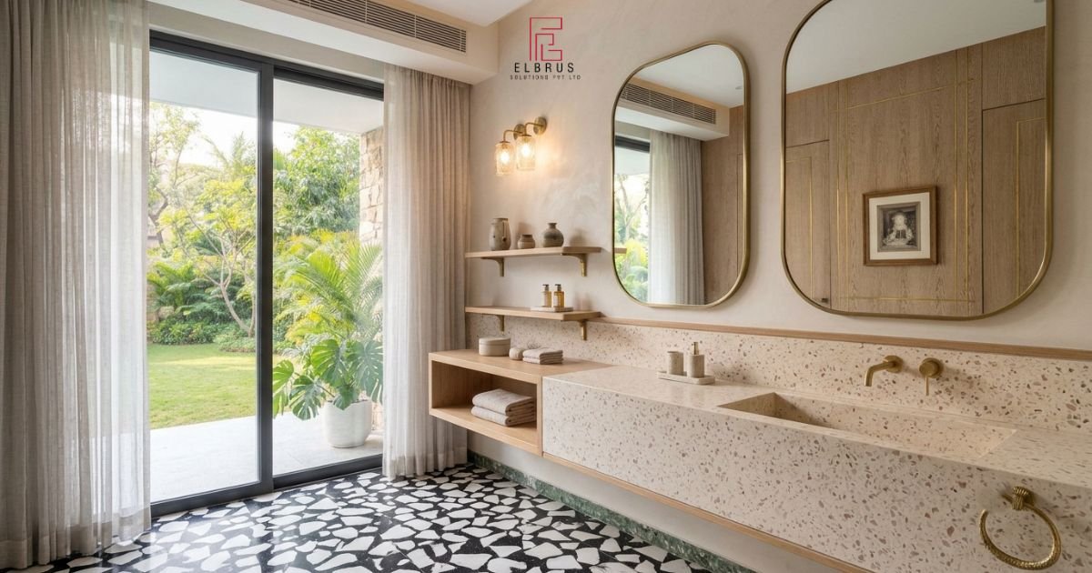
The right terrazzo palette can influence the entire character of an interior. Warm neutrals offer a welcoming foundation, green tones bring a nature-inspired quality, black and white introduce contrast, and richer combinations such as charcoal and copper create a distinctive architectural statement.
Rather than choosing a color combination simply because it is popular, consider how the terrazzo will interact with the room’s lighting, furniture, materials, and intended use. Carefully selected aggregates, a suitable finish, and well-coordinated surrounding elements can help create an interior that feels considered and cohesive.
For customized terrazzo flooring, wall panels, tabletops, vanities, and other architectural surfaces, connect with Elbrus Solutions to discuss the right color and material options for your next project.
Website: https://elbrussolutions.in/